Designing products where strategy, systems, and interfaces meet.
I help teams turn complex product ideas
into clear, usable systems.
Connecting business goals, user behavior,
and design execution.
Let's build
something together.
Open to freelance projects and full-time opportunities.
I'm a Product Design Leader. Based in Bogotá, working for the world.
I've worked across fintech, payments infrastructure, and digital platforms, helping teams turn product ideas into solutions people can understand and use.
Strategy, systems, and interfaces. Making complex things simple and ambiguous things clear.
Let's build
something together.
Open to freelance projects and full-time opportunities.
Project Title
Check back soon.
Let's build
something together.
Open to freelance projects and full-time opportunities.
Building a BNPL Marketplace
How a checkout financing tool evolved into a consumer-facing commerce platform
In 2021 I joined a BNPL platform in Latam, it was widely used at checkout, but users had little understanding of the product beyond the purchase moment.
By introducing a mobile app focused on clarity, credit understanding, and payments, we turned the product into a direct relationship channel with users.
Over time, the app evolved into a commerce discovery surface for merchants.
This article explores how user contact, product strategy, and interface design helped transform a checkout feature into a platform experience.
A note on the designs shown here
To respect confidentiality agreements, the interface designs shown in this article have been recreated and slightly refined.
The visual language has been updated, while the product decisions, flows, and experience principles reflect the work developed during the original project.
Building a BNPL Marketplace
At the time of this project, the BNPL platform operated primarily inside partner stores.
Customers could purchase a product and split the payment into three installments with zero interest, receiving approval in just a few minutes. After completion of payment of first purchase, users were assigned a dynamic credit line that could grow over time based on good payment behavior.
The model worked great on e-commerce and in physical retail checkouts.
However, it had a structural limitation: the platform had almost no relationship with users outside the purchase moment.
Customers remembered the store where they bought their product, but rarely the financing service enabling the purchase.
The question we started exploring was:
How can we increase the relationship with our users beyond checkout?
This question led to the idea of launching the platform's first mobile app.
But before designing the app, we needed to understand something more fundamental: how did users actually perceive and experience the product?
Understanding the User Relationship
Instead of starting with internal assumptions, I conducted a simple research exercise.
For two weeks, I personally called users every day. More than 200 conversations took place during this period.
Each call revolved around three simple questions:
- What do you dislike about the service?
- What do other services do better?
- What do you think about your available credit?
The goal was to understand how people actually related to the product.
Very quickly, clear patterns emerged.
Many users did not recognize the financing provider behind their purchase. When I introduced myself, it often took a moment before they connected the call to the transaction they had made in a store.
Another recurring problem was payments.
Users were not failing to pay because they lacked money. They simply did not know how, where, or when to pay their installments.
Trust was also fragile.
Customers tended to trust the store brand, not the financing service enabling the purchase.
Finally, many users did not realize they had a dynamic credit line that allowed them to continue purchasing as they paid their installments.
These insights pointed toward a clear opportunity. The product lacked clarity and relationship.
Designing the First Version of the App
The first version of the mobile app was intentionally simple.
The goal was to explain the product beyond the checkout moment and help users manage their relationship with the platform.
The initial experience focused on three essential needs.
First, the app needed to explain how the credit product worked. Users needed to clearly understand:
- How much they owed
- How much they could still spend
- When their next payment was due
Second, the experience needed to clarify the relationship between these concepts. Paying an installment increased the available credit line. Understanding this relationship was key to helping users confidently reuse the product.
Third, users needed an easy way to complete their payments directly in the app, while also enabling digital payment channels outside the app.
Together, these elements created the foundation of the mobile experience.
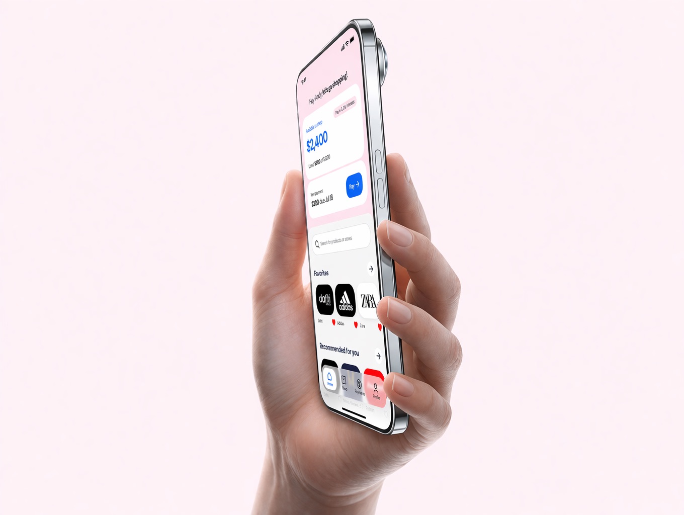
The Key Interface Decision
To make these concepts understandable, I proposed a central interface component that connected the most important elements of the product.
This component displayed three pieces of information together:
- The available credit line
- The next payment due
- The total outstanding balance
This design was developed in collaboration with the product team and became the central card of the app's home screen.
The intention was simple.
Users should immediately understand what they owe, what they can spend, and how their payments affect both.
Because the product functions as a dynamic credit line, these concepts are inseparable.
If users did not understand their relationship, they could not fully understand the product.
Bringing them together into a single interface element helped clarify the logic of the service and gave users confidence in using it repeatedly.
Early Signals After Launch
About two months after launching the MVP, the team began observing important signals.
The app quickly gained traction among users.
Within a short period, around 30% of users logged into the app at least once.
Users who made their payments through the app showed significantly higher payment punctuality, with roughly 85% paying their installments on time.
This was a powerful signal.
The app was not only improving the user experience. It was also improving financial behavior and credit performance.
This insight strengthened the case for making the app a central part of the product experience.
Learning from Real Usage
As adoption grew, product data began revealing new patterns in how people interacted with the app.
Several signals began shaping the next iteration of the product.
Debt clarity
As users accumulated multiple purchases, the debt overview became harder to interpret.
Users struggled to understand how individual purchases related to their upcoming payments and overall debt.
To address this, a dedicated payments and purchases section was introduced, allowing users to review each transaction and clearly understand how their debt was structured.
Credit line behavior
Another recurring question from users was how their credit limit changed over time.
The credit model was dynamic. As users made purchases and paid on time, their available limit increased. If payments were delayed for too long, the credit line could temporarily freeze.
Although users had a general sense of this relationship, the mechanics behind it were not always clear.
To improve transparency, the interface was adjusted to better surface the relationship between payments, debt, and available credit, reinforcing how responsible usage directly affected purchasing power.
Category Browsing
The categories section received a large number of taps but converted poorly.
This suggested that users were attempting to browse, but the structure did not match how they explored products.
The browsing experience was redesigned with a deeper category structure, allowing users to navigate merchants through more specific product groupings.
Repeat purchases
Users who purchased from more than two different stores repeated their purchases about 27% more often.
This suggested that encouraging exploration across merchants could increase retention.
To support this behavior, a favorites section was introduced where users could save stores they were interested in. Merchants that users had purchased from multiple times were also surfaced automatically, making it easier to return to familiar stores.
Search behavior
Search interactions revealed that users were not primarily searching for stores.
They were searching for products.
To respond to this pattern, product tags were added to stores, highlighting the most searched items each merchant offered and helping users discover relevant merchants more quickly.
Together, these changes gradually shifted the app from a credit management tool into a place where users could also explore and shop.
When the App Became a Growth Channel
As the product evolved, the scale of the platform continued to grow.
The app reached roughly 600,000 active users, measured as users who interacted with the app at least once within a six-week window.
At the same time, the platform had expanded to more than 2,000 partner merchants.
Another interesting signal began to appear.
A growing share of online purchases financed through the platform were starting inside the app itself.
This meant the app was not just helping users manage their credit. It was also sending customers to merchants.
This opened a new strategic opportunity.
If the app was influencing where users shopped, it could become a customer acquisition channel for partner stores.
This idea introduced the possibility of an attribution model, where purchases originating from the app could generate additional revenue from merchants.
The product was beginning to move beyond financing. It was becoming part of the commerce discovery experience.
Exploring the Future Marketplace
With this new direction in mind, we began exploring how the product experience could evolve.
One insight kept appearing in both user research and product data.
People do not shop for stores. They shop for products.
This led to several exploration concepts.
One direction explored a product-based marketplace, allowing users to discover products and compare offers across multiple merchants.
Another concept focused on deal-based discovery, inspired by travel platforms where users can track prices and receive alerts when deals appear.
A third direction experimented with community-driven deals, where groups of users could collectively unlock discounts by showing interest in specific products.
These explorations were not intended to immediately replace the existing experience. Instead, they were designed to test mechanisms that could increase exploration, engagement, and repeat purchases.
Prototypes were tested with users to gather feedback on these interaction patterns.
Some of these ideas later influenced product directions after my time with the company.
Reflection
What started as an attempt to clarify a financing product gradually transformed into something larger.
The mobile app helped shift the platform from being an invisible checkout feature into a product users could understand, manage, and interact with directly.
Design played a central role in this transformation.
Not only through interface decisions, but through the ability to translate user behavior, product strategy, and business goals into a coherent experience.
In the process, the product moved closer to becoming a commerce platform, rather than simply a financing tool.
Let's build
something together.
Open to freelance projects and full-time opportunities.
Designing Payments on Real-Time Rails
Turning real-time infrastructure into understandable and adoptable money flows
We operated the infrastructure connecting banks to real-time payment networks across Latin America. From the inside, the gap was visible: peer-to-peer transactions were running at over 10 million per month in the first country where we had API access. Business-initiated transactions barely reached 30,000.
Our hub was the connection point between financial institutions, but businesses had no way to use it. We opened the APIs. As Lead Designer, I focused on making those APIs usable as actual products, not just as technical documentation.
A note on the work shown here
To respect confidentiality agreements, specific implementations, clients, and interfaces have been generalized.
The flows shown reflect the product and design work developed during the project, adapted to explain how the system works.
Context
Real-time payment systems had already reached strong adoption in peer-to-peer transactions across Latin America. Sending money instantly between aliases and accounts, across any bank, regardless of financial institution, was already part of everyday user behavior.
That interoperability is what made RTP powerful: money could move from any account to any account, same bank or different, in seconds.
But that adoption did not translate into business usage.
For financial institutions, this created a gap. Transactions existed, but not a clear way to build products or generate revenue from them. Businesses still relied on slower systems for payouts, collections, and operational money movement.
The infrastructure was there. What was missing was not capability, but clarity.
Our company operated a connection hub that allowed banks to integrate once with the real-time network. This hub was originally built to power P2P flows, but its position as the central link between financial institutions created an opportunity we hadn't fully explored: exposing APIs so external businesses could also initiate transactions on top of the network.
We opened those APIs. And that's where things got interesting.
The Problem
Even with our APIs available, adoption among businesses was surprisingly low.
More than 50 fintechs had integrated with our hub. But when we looked at actual usage, only 4 or 5 were generating any significant volume. The rest had connected and stopped. Business transactions were stuck at around 30,000 per month, a fraction of what the infrastructure could handle.
The issue was not technical. The connections worked. The problem was that teams didn't know what to do with them once they had access.
A simple question like:
"How do I implement a real-time cash-out for my users?"
did not have a clear answer.
Each team had to figure out their own approach: what the flow should look like, how to identify users, how to handle errors, how to communicate status back to their product. This led to inconsistent implementations, long integration cycles, and in many cases, teams simply not moving forward at all.
The system worked. But product teams were left interpreting it entirely on their own.
My Role
My focus was on closing the gap between what our APIs could do and what product teams could actually build.
I started with desk research, mapping the most common use cases, the regulatory context in each country, and where real-time payments added the most value. From that, I designed transaction flows as templates. Not UI kits. Actual screen-by-screen flows that showed how a specific use case should behave from start to finish. Together with the team, we documented each use case from three angles: technical, product, and UX, so any fintech could pick it up and implement it without needing to interpret the infrastructure themselves.
How Money Moves
Before designing anything, we made the system explicit.
Every transaction follows the same structure. A business triggers a payment through a bank API. The bank routes the request through our connection hub. The request reaches the real-time network and is processed by the receiving bank, which could be any bank on the network, regardless of institution. Funds are credited, and a confirmation is returned.
Our hub standardizes this flow so each participant only handles their part. Interoperability is built in. The sender and receiver don't need to be at the same bank.
Once that structure was clear, we could start defining what it meant for specific use cases.
Core Flows
Two flows became the foundation for nearly every business use case we encountered. The idea was not to create something new but to define how to use what was already there, in a way that any team could pick up and build on.
Cash-in
A user moves money into a wallet or platform, whether as a service payment, subscription, top-up, or transfer to a third party.
The flow defines how the user is identified, how the source account is selected, and how the transaction is confirmed. Because RTP is interoperable, the source can be any account on the network, not just accounts at a specific bank.
The value becomes visible immediately. The action is instant, and the result is certain.
Cash-out
A user moves money out of a platform into a bank account: payroll, royalty payments, refunds, withdrawals, and more.
The flow focuses on destination selection, validation, and instant confirmation. The destination can be any account on the network, across any financial institution.
The experience is not only about speed. It is about removing uncertainty. Users know the money arrived, immediately.
Enabling Real Use Cases
Once the core patterns were defined, teams could focus on applying them rather than inventing them. Here are some of the most impactful use cases we helped unlock.
Cash-Out Patterns
Instant Lending Disbursement
In micro-lending products, credit approval could already happen within minutes. But receiving the money often took hours or days, breaking the "instant lending" promise at the last step.
By applying our cash-out flow templates, disbursement became immediate. Approval and access to funds both happened in seconds, to any bank account on the network, not just one specific institution.
Refunds
Refunds are typically a friction point in digital commerce. Users face long waits or receive store credits instead of real money back.
With real-time cash-out flows, refunds could be processed instantly to any account. Depending on the implementation, users could provide destination details or trigger the refund themselves. Trust improved, and post-purchase friction dropped significantly.
Batch and Payroll Disbursements
In many Latin American markets, payroll was constrained by bank relationships. Employees needed accounts at a specific institution to receive pay quickly. With interoperable RTP, that constraint disappeared. Payments could reach any bank instantly, using simple identifiers like an employee ID or alias.
Companies integrated these flows directly into HR and ERP systems, simplifying operations while removing bank dependency for employees.
Cash-In Patterns
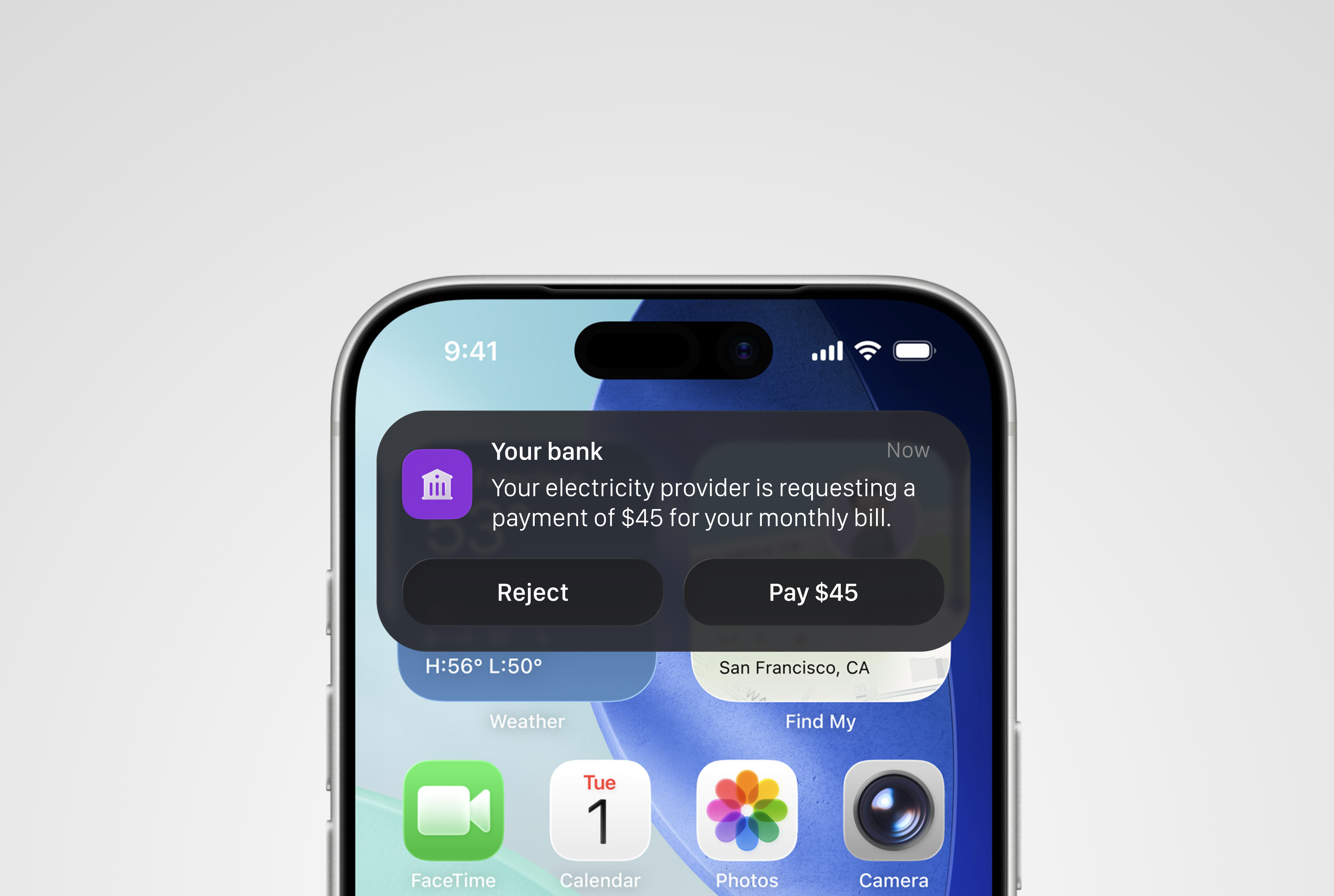
Service Payments (Request-to-Pay)
Utility and subscription payments were enhanced using request-to-pay flows. A payment request could be initiated by the service provider and received by the user directly in their banking app, no card needed, no manual transfer required.
For service providers, payment, clearing, and settlement happened simultaneously. This also enabled recurring payments for services without relying on card infrastructure.
Wallet and Platform Top-Ups
For platforms handling crypto, stablecoins, foreign currencies, or any balance-based experience, real-time top-ups changed the economics significantly. Funds arrived instantly, reducing exposure to currency fluctuations and improving reconciliation. Balances updated in real time for both users and internal systems.
E-commerce Payments
For e-commerce, real-time payments provided a clean alternative to card infrastructure. Transactions processed instantly, reconciliation improved, and users got a reliable payment experience without the friction of card entry or redirects.
Cash as a Network Edge
One of the most impactful applications came from small neighborhood stores, ones that already acted as informal financial access points in underserved areas.
By combining real-time payments with simple POS tools, these stores became interoperable cash-in and cash-out agents. A user could deposit or withdraw money for any participating bank at any of these locations.
A typical flow: a user brings cash to the store. The owner initiates a transfer to the user's account on the network. The user pays a small fee. For withdrawals, the process reverses through a request-to-pay interaction.
This created a new economic model. Users got financial access, store owners generated income, and fintechs captured volume. More importantly, it extended real financial services to areas where traditional bank infrastructure simply didn't exist.
A Wrong Turn
Our early assumption was that payment service providers would be the fastest path to scale. They already distributed transactional flows, had the infrastructure, and several were genuinely interested.
What we learned is that PSPs don't create new payment behaviors. They distribute existing ones. Their model depends on flows that are already fully adopted, already proven on traditional rails. Cards, online transfers, established methods. Asking them to build something new meant asking them to take on market risk they weren't set up for.
They preferred to wait for the market to figure it out first, then adopt once it was safe. That was a reasonable call on their part. It just wasn't the shortcut we thought it would be.
The real traction came from fintechs building new products, not from distributors of existing ones.
Outcome
Business transaction volume grew from around 30,000 per month to a peak of 2 million monthly transactions, a 65x increase. At that point, P2P transactions on the same network had reached 40 million per month. Business usage was growing, and the gap with P2P showed how much headroom remained.
Most of the volume was still coming from a small group of early adopters who had figured out how to use the system well. The broader base of integrated fintechs had barely started. The potential was clearly much larger.
The infrastructure hadn't changed. What changed was the ability to understand how to use it. By giving product teams clear flows, documented patterns, and concrete references, they could move from API access to working product significantly faster, with far fewer false starts.
Reflection
This work was less about designing interfaces and more about designing understanding.
The infrastructure was already powerful. The challenge was making it legible, turning technical capability into something product teams could see themselves using.
What I found is that design at this layer is mostly about translation: between what a system can do and what a team can confidently build. When that translation exists, adoption follows.
By defining flows instead of features, we created a shared language for how real-time transactions work. That clarity was the real product.
Let's build
something together.
Open to freelance projects and full-time opportunities.